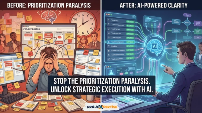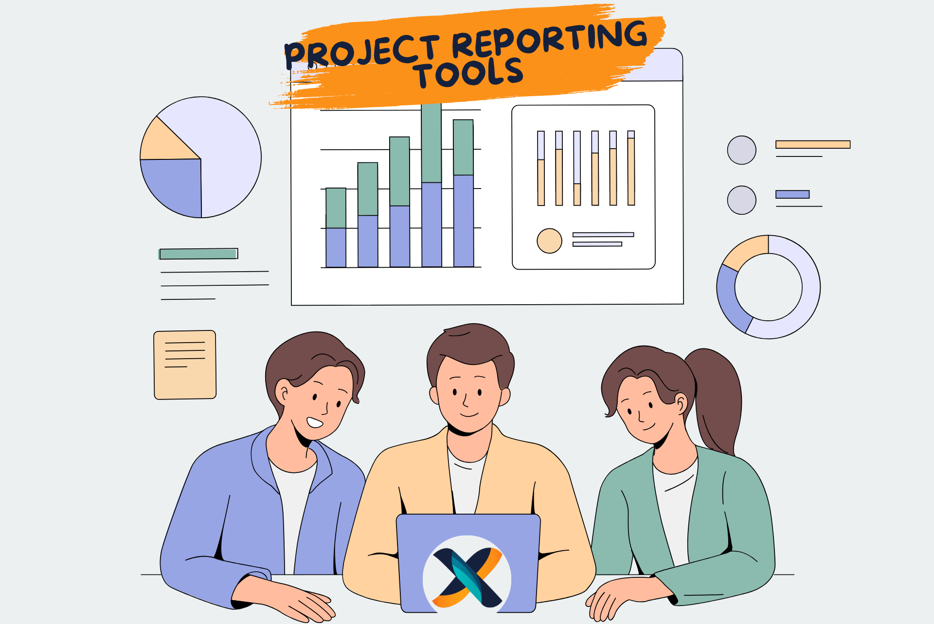
Effective reporting tools are the project manager’s best friend. They offer a clear view of what’s happening, what’s at risk, and what decisions need to be made. In today’s fast-paced, data-driven environment, using the right reporting tools can mean the difference between project success and costly overruns.
This comprehensive guide explores 10 top tools that help teams track progress, communicate updates, and gain actionable insights. Whether you’re managing software teams, marketing campaigns, or product launches, there’s a solution here for you. We’ll dive deep into each tool’s capabilities, ideal use cases, and real-world applications to help you make an informed decision.
Why Reporting Tools Matter for Project Managers
Project reporting tools enable project managers to transform raw data into actionable intelligence. These platforms serve as the nervous system of modern project management, connecting disparate information sources into coherent narratives. Without them, managers rely on scattered spreadsheets, email threads, and verbal updates that create information silos and blind spots.
The Business Case for Reporting Tools
Organizations that invest in proper reporting infrastructure see measurable returns. Studies consistently show that data-driven project management reduces delivery time by up to 30% and increases success rates significantly. When everyone can see the same real-time information, decision-making accelerates and conflicts decrease.
Reporting tools enable project managers to track performance metrics in real-time rather than waiting for weekly status meetings. They identify risks and bottlenecks before they escalate into full-blown crises. Most importantly, they communicate clearly with stakeholders using visual dashboards that tell stories at a glance.
Building Accountability Through Visibility
Visibility creates accountability naturally. When team members know their contributions are tracked and visible to stakeholders, quality improves. Reporting tools ensure accountability and visibility across teams without creating oppressive micromanagement. The difference lies in transparency versus surveillance.
With access to dashboards, charts, and live updates, reporting tools replace guesswork with data. In project management, data equals control. The question isn’t whether you need reporting tools, but which ones match your specific context and challenges.
Understanding Your Reporting Needs
Before diving into specific tools, assess your organization’s reporting requirements. Different teams have vastly different needs based on their methodology, industry, and stakeholder expectations. A software development team using Agile has different needs than a construction project following Waterfall principles.
Defining Your Reporting Objectives
Start by identifying what you need to measure and communicate. Budget-focused organizations need robust financial tracking and variance reporting. Agile teams require velocity charts and sprint burndowns. Client-facing agencies need professional reports that can be shared externally without exposing internal details.
Consider your audience carefully. Executive stakeholders want high-level summaries and trend analysis. Team members need operational details and task-level information. Clients expect professional presentations that highlight value delivered. The best reporting tools accommodate multiple perspectives from the same underlying data.
Integration capabilities matter enormously. Your reporting tool should connect seamlessly with your existing project management software, time tracking systems, and communication platforms. Manual data entry creates bottlenecks and introduces errors that undermine trust in your reports.
1. Microsoft Power BI: Enterprise-Grade Analytics
Microsoft Power BI stands as the gold standard for enterprise reporting and business intelligence. This powerful platform transforms data from virtually any source into interactive visualizations that reveal patterns and insights invisible in raw data. Power BI represents Microsoft’s commitment to making data analytics accessible to business users, not just data scientists.
Key Features That Set Power BI Apart
Customizable dashboards with advanced visualizations allow you to tell compelling data stories. The drag-and-drop interface makes creating complex visualizations surprisingly intuitive once you understand the fundamentals. Real-time data sync with Microsoft Project, Excel, and hundreds of other tools ensures your dashboards always reflect the current reality.
AI-powered data modeling capabilities distinguish Power BI from simpler reporting tools. The platform can identify trends, anomalies, and correlations automatically. Natural language queries let stakeholders ask questions in plain English and receive instant visual answers. This democratizes data access without requiring everyone to become analysts.
The mobile experience deserves special mention. Power BI’s mobile apps deliver full dashboard functionality on tablets and smartphones. Project managers can check critical metrics during client meetings or while traveling without compromising detail or functionality.
Best Use Cases for Power BI
Large enterprises needing in-depth, cross-departmental analytics and visual reports find Power BI invaluable. When you’re managing portfolios of projects across multiple business units, Power BI’s ability to synthesize data from diverse sources becomes essential. Financial services, healthcare, and government organizations particularly benefit from its robust security and compliance features.
Power BI excels at answering complex questions that require combining data from multiple systems. Want to correlate project performance with resource utilization and budget allocation? Power BI makes these multi-dimensional analyses straightforward. The platform scales from individual dashboards to organization-wide analytics without degradation.
Understanding the Limitations
Power BI has a steeper learning curve than simpler tools. New users often feel overwhelmed by the abundance of options and features. Organizations should plan for training time and consider designating Power BI specialists who can create templates for others. The initial investment in learning pays dividends through powerful capabilities.
Complex dashboards require time to configure properly. Rushing this process produces cluttered, confusing reports that fail to communicate effectively. Start simple and add complexity gradually as users become comfortable with basic visualizations. Moreover, integrating with CRM software and other enterprise systems may require IT support.
Real-World Success Story
A financial services company managing a portfolio of 50+ concurrent projects struggled with fragmented reporting. Each project manager used different templates, making portfolio-level analysis nearly impossible. After implementing Power BI, they created standardized dashboards that automatically pulled data from Microsoft Project, Jira, and their financial systems.
The results were transformative. Executive reporting that previously required three days of manual compilation is now generated automatically. Leadership could drill down from portfolio views to individual project details instantly. Risk identification improved dramatically as the AI-powered analytics flagged projects deviating from baseline patterns. Within six months, they reduced project overhead by 15% while improving delivery predictability.
2. Tableau: Visualization Powerhouse
Tableau pioneered the concept of making data visualization accessible to business users rather than limiting it to technical specialists. The platform’s intuitive interface masks sophisticated analytical capabilities beneath an elegant surface. Organizations that prioritize visual communication and data storytelling consistently choose Tableau for its unmatched visualization quality.
What Makes Tableau Special
Beautiful, interactive dashboards that feel more like experiences than reports set Tableau apart. The platform treats data visualization as both science and art. Users can create stunning visualizations without coding, yet the platform offers deep customization for those who need it. Hovering over data points reveals contextual information, and clicking filters entire dashboards dynamically.
Easy connection to nearly any data source removes integration barriers. Whether your data lives in spreadsheets, databases, cloud services, or specialized project management tools, Tableau can access it. The platform handles massive datasets effortlessly, maintaining performance even when analyzing millions of records. This scalability means Tableau grows with your organization.
Drag-and-drop analytics and predictive modeling bring advanced statistical techniques to non-statisticians. You can identify trends, forecast outcomes, and perform what-if analysis without writing complex formulas. The platform guides users toward appropriate visualization types based on the data being analyzed, preventing common mistakes that lead to misleading charts.
Ideal Applications for Tableau
Data-heavy teams that prioritize powerful visual insights benefit most from Tableau. Project management offices (PMOs) managing complex portfolios find Tableau’s combination of analytical depth and presentation quality unbeatable. When you need to present to executives or boards who expect polished, professional visualizations, Tableau delivers.
The platform shines in industries where data analysis drives decisions. Pharmaceutical companies tracking clinical trial projects use Tableau to visualize complex protocols and outcomes. Marketing agencies use it to correlate campaign performance with project timelines and budgets. Engineering firms use it to track resource utilization across hundreds of simultaneous projects.
Considering the Drawbacks
High license costs place Tableau beyond reach for some organizations. The per-user pricing model becomes expensive quickly as teams grow. Small businesses or startups might find better value in more affordable alternatives unless their business model depends heavily on data visualization.
The platform can feel overwhelming for teams unfamiliar with data science concepts. While Tableau makes advanced analytics accessible, users still need to understand what different statistical measures mean. Training is essential to prevent misuse or misinterpretation of analytical features.
Expert Perspective
Tableau shines in PMOs where project and portfolio-level reporting must be both analytical and presentation-ready. The platform serves dual purposes: supporting deep analytical work during planning and review sessions, then creating polished executive presentations from the same data. This versatility eliminates the need to recreate insights in PowerPoint or other presentation tools.
Organizations using Tableau typically designate visualization specialists who master the platform and create templates for others. This center-of-excellence model maximizes return on investment while ensuring consistency and quality across the organization.
3. Monday.com: Visual Flexibility for Teams
Monday.com reimagined project management by starting with visual communication rather than task lists. The platform’s colorful, engaging interface makes project tracking feel less like work and more like a collaborative game board. This approachability has made Monday.com popular with creative teams, agencies, and marketing departments who value aesthetics alongside functionality.
Core Capabilities of Monday.com
Visual project tracking through timelines, kanban boards, and calendars provides multiple perspectives on the same work. Teams can switch between views instantly based on what they need to understand. The timeline view shows dependencies and critical paths, while kanban boards focus on workflow status. This flexibility accommodates different thinking styles within the same team.
Reporting dashboards that reflect real-time status eliminate the delay between work completion and report updates. As team members update their tasks, dashboards automatically refresh. Color-coded status indicators make identifying problems trivial even from across the room. Stakeholders can glance at a dashboard and immediately understand project health.
Pre-built reporting templates for quick implementation reduce time-to-value dramatically. Monday.com includes templates for common scenarios like sprint planning, campaign management, and product launches. Teams can start with a template and customize it rather than building from scratch. This approach works particularly well for standardized processes that repeat across projects.
Where Monday.com Excels
Agencies and marketing teams that need flexible visual reports find Monday.com ideal. The platform’s emphasis on visual communication aligns perfectly with creative work cultures. When your stakeholders respond better to colors and shapes than numbers and text, Monday.com speaks their language. The platform also excels at managing multiple small to medium projects simultaneously.
Teams that value collaboration and transparency appreciate Monday.com’s social features. Built-in communication threads keep discussions attached to relevant tasks. @mentions notify team members automatically. The platform creates a single source of truth that reduces email chaos and meeting time. Understanding stakeholder communication becomes easier when everyone works from the same visual foundation.
Recognizing the Limitations
Advanced features gated behind paid plans can frustrate growing teams. Monday.com’s freemium model provides basic functionality for free but requires paid plans for reporting, automation, and integrations. As teams expand their usage, costs escalate. Organizations should budget for premium tiers rather than expecting to remain on free plans long-term.
Limited financial and risk reporting means Monday.com works best for operational tracking rather than comprehensive project management. The platform handles task completion, timelines, and workload well but lacks sophisticated budget variance analysis or quantitative risk assessment. Teams focused on detailed financial management should supplement Monday.com with specialized tools or consider alternatives.
4. Wrike: Cross-Functional Powerhouse
Wrike positions itself between lightweight task managers and heavyweight enterprise platforms. The tool offers sophisticated capabilities without overwhelming complexity. Organizations with diverse teams working on interconnected projects appreciate Wrike’s ability to provide appropriate views and functionality to each stakeholder without fragmenting information.
Wrike’s Distinguishing Features
Dynamic project reports and time tracking provide insight into both what’s being done and how long it takes. The platform correlates time entries with tasks automatically, revealing accurate effort data without additional administrative burden. This transparency helps identify efficiency opportunities and improves future estimation accuracy.
Budget dashboards and utilization charts bring financial awareness to operational management. Wrike tracks actual costs against budgets in real-time, alerting managers when variances exceed thresholds. Resource utilization views show which team members are overloaded and which have capacity, enabling better load balancing. These features make Wrike suitable for organizations where project economics matter significantly.
Integration with tools like Salesforce and Google Workspace ensures Wrike fits into existing technology ecosystems. The platform doesn’t try to replace everything; instead, it connects to specialized tools and aggregates their data. CRM integration particularly benefits organizations managing client projects where sales and delivery must coordinate closely.
Optimal Use Cases
Cross-functional teams managing multiple large-scale projects benefit most from Wrike. When projects involve contributors from different departments with different tools and workflows, Wrike provides the connective tissue. Marketing teams working with product development, for example, can collaborate smoothly despite different work styles.
Professional services firms find Wrike’s combination of project management and time tracking particularly valuable. The platform supports client billing based on accurate time tracking while maintaining project visibility. Resource managers can optimize utilization across projects, reducing bench time and improving profitability.
Potential Drawbacks
Interface complexity may deter new users initially. Wrike offers many ways to accomplish the same task, which provides flexibility but increases the learning curve. Organizations should invest in proper onboarding and create simplified starter configurations that reveal features progressively as users grow more sophisticated.
The learning curve for custom reports requires patience. While Wrike includes many pre-built reports, creating custom views that match unique organizational needs takes time. Designating report builders who can create templates for others helps teams realize value faster.
5. Jira: The Agile Standard
Jira dominates Agile software development like no other tool. Atlassian’s flagship product has become synonymous with Agile project management in technology companies. The platform’s deep understanding of Scrum, Kanban, and other Agile frameworks makes it the natural choice for development teams. However, its capabilities extend well beyond software to any project benefiting from iterative, adaptive management.
Jira’s Core Strengths
Scrum and Kanban board reports provide instant visibility into sprint progress and workflow efficiency. The platform tracks every state change, enabling sophisticated analysis of cycle time, throughput, and bottlenecks. Teams can identify impediments quickly and optimize their processes based on empirical data rather than assumptions.
Burndown, velocity, and cumulative flow charts are Agile staples that Jira generates automatically. These visualizations help teams understand whether they’re on track to meet sprint goals and commitments. Velocity trending over multiple sprints reveals whether the team is improving, declining, or maintaining stable productivity. This data supports realistic planning and continuous improvement.
Real-time tracking of Agile sprints ensures everyone sees the same picture. As developers update issues, dashboards refresh immediately. Daily stand-ups become more efficient when the team can review a shared dashboard rather than relying on verbal updates. Transparency increases accountability without creating oppressive oversight.
When Jira Makes Sense
Agile development teams in the software and tech industries represent Jira’s core audience. The platform was built by developers for developers, and this heritage shows in every feature. Teams practicing Scrum, Kanban, or SAFe find that Jira supports their methodology naturally. The extensive plugin ecosystem extends functionality for specialized needs.
Organizations with complex DevOps workflows benefit from Jira’s integration with developer tools. Connections to GitHub, Bitbucket, and CI/CD pipelines create complete visibility from requirement to deployment. Project managers can track not just what’s planned but what’s actually deployed to production. This end-to-end visibility is crucial for modern software delivery. Many teams also leverage Kanban boards alongside Jira for enhanced visual management.
Acknowledging Jira’s Limitations
Jira is not designed for financial reporting or resource management beyond basic capacity planning. Organizations needing robust budget tracking, cost analysis, or financial forecasting must supplement Jira with specialized tools. The platform excels at workflow and delivery tracking but treats financial management as secondary.
The steep learning curve for non-technical users creates adoption challenges. Jira’s interface assumes familiarity with software development concepts. Marketing teams, HR departments, or other non-technical groups often struggle with terminology and workflows designed for engineers. Atlassian’s attempts to make Jira more accessible have improved matters, but the tool remains most comfortable for technical audiences.
6. ClickUp: All-in-One Flexibility
ClickUp entered the crowded project management market with an ambitious promise: replace all other productivity tools with one comprehensive platform. While that vision remains aspirational, ClickUp offers an impressive breadth of functionality. The platform accommodates diverse work styles and methodologies within a single environment, reducing tool sprawl and integration complexity.
ClickUp’s Comprehensive Features
Reporting for tasks, goals, time, and milestones provides multi-dimensional project visibility. The platform tracks not just what’s being done but why it matters and whether it contributes to broader objectives. Goal tracking connects daily work to strategic objectives, helping teams maintain focus on what truly matters. Time tracking integrates seamlessly, supporting both productivity analysis and client billing.
Custom widgets to tailor dashboard views let each stakeholder see exactly what they need. Marketing managers might want campaign status, while executives want portfolio health. ClickUp enables both perspectives from the same underlying data. The flexibility prevents information overload by showing relevant details while hiding the rest.
Seamless integration with Slack, GitHub, and Google Calendar ensures ClickUp fits into existing workflows. The platform acts as a hub that connects various tools without forcing complete migration. Teams can adopt ClickUp gradually, connecting existing tools before eventually consolidating if desired. Understanding how to automate workflows becomes easier when your tools connect seamlessly.
ClickUp’s Sweet Spot
Startups and fast-scaling teams needing customizable, all-in-one reporting appreciate ClickUp’s versatility. Young companies often can’t justify multiple specialized tools, making ClickUp’s comprehensive approach attractive. The platform scales from small teams to hundreds of users without requiring tool changes that disrupt momentum.
Remote-first organizations benefit from ClickUp’s emphasis on asynchronous collaboration. The platform’s robust notification system keeps distributed teams aligned without requiring constant meetings. Documentation, chat, and task management coexist in one place, reducing context switching and the number of tabs team members must monitor.
Potential Challenges
Setup time can be longer for advanced use cases because of the enormous number of configuration options. ClickUp’s flexibility is both a strength and a weakness. Teams must make many decisions about how to structure their workspace, which views to create, and which automations to implement. This upfront investment pays off with tailored functionality, but it requires patience.
The platform may overwhelm smaller teams with too many features they don’t need. A five-person startup might find ClickUp’s enterprise-grade capabilities excessive. The interface becomes cluttered when every possible feature is visible. Teams should consciously hide or disable features they don’t use rather than accepting the default maximalist configuration.
7. Asana: Simplicity and Elegance
Asana carved out a unique position by prioritizing user experience above feature accumulation. The platform does fewer things than competitors but does them exceptionally well. This focus on core project management with minimal friction appeals to teams who want to manage projects, not manage project management software. Asana proves that sometimes less is more.
Asana’s Key Capabilities
Status updates visible across projects keep everyone informed without requiring manual reporting. Team members post updates that automatically distribute to stakeholders following that project. This push notification model reduces the need for status meetings while ensuring important information reaches relevant people. The social features feel natural rather than forced.
Workload and timeline views help managers balance resource allocation across projects. The workload view shows each team member’s assigned work, making overallocation obvious. Managers can redistribute tasks before burnout occurs. Timeline views display dependencies and critical paths using familiar Gantt-style visualization without Gantt chart complexity.
Integration with Google Sheets for custom reports extends Asana’s native reporting capabilities. While Asana provides solid built-in reports, teams with unique requirements can export data to Sheets for custom analysis. This escape hatch ensures Asana doesn’t become limiting as analytical needs grow more sophisticated.
Where Asana Shines
Teams seeking a clean, intuitive interface with collaborative reporting choose Asana for its user experience. The platform requires minimal training because interactions feel obvious. New team members become productive quickly without extensive onboarding. This accessibility makes Asana popular with non-technical teams who found traditional project management tools overwhelming.
Organizations managing many parallel small projects benefit from Asana’s portfolio management. Marketing teams running dozens of campaigns simultaneously can track them all without losing visibility. The platform scales from individual tasks to organizational portfolios using consistent metaphors throughout. For teams comparing tools, reviewing ClickUp vs Asana provides valuable insights.
Understanding the Trade-offs
Asana is less customizable than Power BI or Tableau for data visualization. The platform provides useful reports but doesn’t attempt to compete with business intelligence tools. Teams needing sophisticated analytical capabilities should plan to export Asana data to specialized tools rather than expecting Asana to replace them.
Limited export options for detailed reports can frustrate teams with specific formatting requirements. Asana’s reports are designed for screen viewing rather than printing or presentation. Organizations producing formal project documentation may need to recreate Asana information in other tools, creating duplication.
8. Smartsheet: Bridging Spreadsheets and Project Management
Smartsheet recognized that millions of people manage projects using spreadsheets despite their limitations. Rather than forcing these users to abandon familiar interfaces, Smartsheet enhanced spreadsheets with project management capabilities. The result bridges traditional spreadsheet culture with modern collaborative features. This approach reduces adoption friction for spreadsheet-dependent organizations.
Smartsheet’s Distinctive Approach
The familiar spreadsheet-style interface minimizes retraining for teams comfortable with Excel or Google Sheets. Rows represent tasks, columns represent attributes, and cells contain values—exactly as users expect. This familiarity accelerates adoption dramatically compared to tools requiring users to learn entirely new paradigms. Teams can be productive on day one.
Project reports with Gantt views, dashboards, and KPIs layer project management structure onto the spreadsheet foundation. Smartsheet automatically generates timeline visualizations from spreadsheet data. Dependencies between rows create critical path calculations. What looks like a spreadsheet behaves like project management software, giving users the best of both worlds.
Alerts, reminders, and automation bring proactive management to reactive spreadsheets. Traditional spreadsheets require users to check them constantly. Smartsheet pushes notifications when conditions are met, deadlines approach, or values change. This shift from pull to push communication ensures important information doesn’t get overlooked. Teams practicing time management strategies find these alerts invaluable.
Ideal Smartsheet Users
Teams moving from spreadsheets to collaborative tools find Smartsheet’s transition path least disruptive. Rather than abandoning spreadsheets entirely, teams enhance them progressively. Existing spreadsheet-based processes can migrate to Smartsheet with minimal disruption. The familiarity reduces change resistance that often derails tool transitions.
Organizations with mature spreadsheet governance appreciate Smartsheet’s structure. The platform provides the control and auditability missing from file-based spreadsheets while maintaining the flexibility spreadsheet users demand. Financial services, accounting firms, and other spreadsheet-heavy industries find this combination compelling.
Recognizing the Constraints
The spreadsheet-style UI can feel restrictive for teams accustomed to modern project management interfaces. Once you’ve experienced visual boards or timeline views, spreadsheets feel dated and limited. Smartsheet’s interface, while familiar, doesn’t leverage modern UX principles as effectively as tools designed without spreadsheet constraints.
Smartsheet doesn’t scale as well for Agile frameworks compared to tools designed for iterative development. The platform’s row-and-column paradigm maps better to predictive project management than adaptive approaches. Agile teams might find Smartsheet workable for backlogs but limiting for sprint management and rapid iteration.
9. Teamwork: Client-Focused Project Management
Teamwork targets a specific niche: agencies and professional services firms managing multiple client projects simultaneously. The platform understands the unique challenges these organizations face, particularly around client communication, billable time tracking, and presenting professional reports to external stakeholders. Features are purpose-built for client-facing work rather than adapted from internal project management.
Teamwork’s Specialized Features
Budget and time reporting tied to client billing integrates financial management with project execution. The platform tracks time entries at the task level, applies billing rates automatically, and generates invoices from actual work. This tight integration eliminates double-entry between project management and accounting systems. Project managers can see profitability in real-time rather than waiting for month-end financial reports.
Custom report templates for project and resource tracking support the diverse reporting needs agencies face. Internal reporting focuses on utilization and capacity planning. Client reporting emphasizes deliverables and value. Teamwork provides templates for both contexts plus the flexibility to create custom reports. Templates ensure consistency while customization accommodates unique situations.
Permission-based client views let external stakeholders access project information without exposing internal details. Clients see their projects and can collaborate with the team, but they don’t see other clients’ work or internal cost structures. This selective transparency builds client confidence while protecting sensitive information. The client portal reduces email communication and provides self-service status checking.
When Teamwork Makes Sense
Client-facing agencies managing external projects with billing needs represent Teamwork’s target audience. Marketing agencies, design studios, consulting firms, and software development shops benefit most. The platform solves problems unique to client services: juggling multiple clients, tracking billable hours, managing scope changes, and presenting professional status reports.
Professional services firms needing to optimize resource allocation across clients appreciate Teamwork’s capacity planning. The platform shows which team members are over-committed and which have availability. Resource managers can balance workload to maximize billable utilization while preventing burnout. Financial dashboards support profitability analysis by client, project type, or service line.
Limitations to Consider
Teamwork offers fewer predictive analytics or AI features compared to enterprise platforms. The platform focuses on execution and reporting rather than forecasting and optimization. Teams wanting machine learning insights or sophisticated what-if analysis must look elsewhere. Teamwork provides solid operational management without the analytical bells and whistles.
The platform lacks the deep integrations found in larger platforms like Jira or ClickUp. While Teamwork connects to common tools, its ecosystem is smaller. Organizations with complex tool chains might find gaps in available integrations. API access enables custom integrations but requires development resources.
10. Trello: Visual Simplicity
Trello pioneered the digital kanban board concept and proved that project management doesn’t require complexity. The platform’s card-based interface makes task management visual and intuitive. While Trello lacks the sophisticated features of enterprise tools, its simplicity is precisely its strength. Small teams and individuals can start managing projects in minutes without training or setup.
Trello’s Core Strengths
Lightweight visual task tracking with Kanban boards provides just enough structure without overhead. Cards represent work items that move across columns representing workflow stages. The drag-and-drop interface makes updates effortless. Team members can see status at a glance and understand what needs attention without analyzing complex reports.
Reporting via Power-Ups like Butler and Reports by Screenful extends Trello’s native capabilities. The platform’s architecture allows third-party enhancements to add features without bloating the core experience. Teams can start simple and add complexity only when needed. This modular approach prevents feature overwhelm while providing growth paths.
Integration with Google Workspace, Slack, and other common tools ensures Trello fits into existing workflows. The platform doesn’t try to replace everything but instead connects to specialized tools. Calendar Power-Ups display due dates in Google Calendar. Slack integration posts notifications to relevant channels. These connections let Trello serve as a lightweight coordination hub.
Trello’s Ideal Applications
Small teams needing a fast, visual way to manage and report tasks find Trello perfect. Startups, small businesses, and individual contributors appreciate the zero-friction startup. You can create a board and start working within minutes. The visual nature makes Trello accessible to non-technical team members who might struggle with traditional project management tools.
Personal project management and side projects benefit from Trello’s simplicity. Individuals managing their own work don’t need enterprise features. Trello provides just enough organization to prevent chaos without imposing unnecessary structure. The free tier offers generous functionality, making Trello accessible to anyone. Learning Trello for beginners takes minimal time investment.
Recognizing Trello’s Limitations
Trello requires external add-ons for reporting beyond basic board views. While Power-Ups add capabilities, they fragment the experience and may incur additional costs. Teams needing robust built-in reporting will find Trello insufficient. The platform works best when reporting needs are light or when teams are willing to use multiple tools.
Limited built-in analytics means Trello won’t satisfy data-driven organizations. The platform tracks card movements but doesn’t provide sophisticated analysis or forecasting. Cycle time analysis, velocity tracking, and other metrics require third-party Power-Ups. Teams focused on continuous improvement through measurement should consider more analytical tools.
How to Choose the Right Reporting Tool for Your Team
Selecting appropriate reporting tools determines whether your investment enhances productivity or creates frustration. The right tool aligns with your team’s size, methodology, technical sophistication, and budget. This decision deserves careful analysis rather than following trends or selecting whatever your peers use.
Starting with Clear Objectives
Identify reporting goals before evaluating tools. Do you need to track budgets, manage Agile velocity, or simply provide visual task status? Different tools excel at different objectives. Financial tracking requires different capabilities than sprint management. Stakeholder reporting needs differ from team coordination needs.
Create a prioritized list of must-have versus nice-to-have features. Must-haves are non-negotiable requirements your tool absolutely must support. Nice-to-haves are valuable but not critical. This distinction prevents feature overload while ensuring essential needs are met. Revisit your list if every feature feels must-have—you probably need to make tougher choices.
Consider your reporting audience carefully. Reports for executives, team members, and clients serve different purposes. Executive reports highlight strategic health and require high-level summaries. Team reports focus on operational details and next actions. Client reports emphasize value delivery and professionalism. The best tools accommodate multiple perspectives from shared data.
Evaluating Team Size and Budget Constraints
Team size dramatically influences tool selection. Small teams often find enterprise tools overwhelming and expensive. Some tools like Trello or Asana work great for small teams with their intuitive interfaces and generous free tiers. These platforms provide immediate value without a significant investment or learning curve.
Platforms like Power BI or Tableau are best suited for large-scale enterprise use where per-user costs are spread across many users. Enterprise tools justify their complexity and cost with sophisticated features that large organizations require. Economies of scale make these investments rational for big companies but prohibitive for small teams.
Budget considerations extend beyond licensing costs. Factor in training time, configuration effort, and ongoing administration. A “free” tool requiring two weeks of configuration and training has hidden costs. Similarly, an expensive tool that works immediately might cost less total when time is valued. Analyze total cost of ownership, not just subscription fees. Understanding how to measure ROI on project management tools helps justify investments to leadership.
Prioritizing Integration Capabilities
Ensure the reporting tool integrates with your existing project management software, CRM, or time-tracking apps. Integration saves time and enhances accuracy by eliminating manual data transfer. Every manual step introduces error potential and requires ongoing labor. Automated integration creates a single source of truth that updates continuously.
Evaluate integration depth, not just availability. Some integrations are one-way data dumps that require manual refresh. Others provide bi-directional real-time synchronization that keeps everything current automatically. Deep integrations are worth paying premium prices because they compound value over time.
Consider your technology ecosystem comprehensively. If your organization heavily uses Microsoft products, Power BI integrates seamlessly. Google Workspace users might prefer tools with strong Google integration. Salesforce customers benefit from tools that connect to CRM data. Choose tools that fit your ecosystem rather than forcing your ecosystem to adapt.
Testing Before Committing
Most platforms offer free trials or freemium tiers. Use these opportunities to test with real projects and real data. Pilot programs reveal strengths and weaknesses that aren’t apparent in demos. Include team members who will use the tool daily rather than making decisions solely at the management level.
Create a structured evaluation process. Define success criteria before testing begins. Measure against these criteria objectively rather than relying on subjective impressions. Survey team members about usability, gather stakeholder feedback on report quality, and measure time spent on reporting activities.
Plan for multiple rounds of testing when evaluating several tools. Sequential testing provides clear comparisons. Run the same project through different tools to see which provides better insights with less effort. This empirical approach produces better decisions than theoretical analysis alone.
Advanced Reporting Strategies
Effective reporting transcends tool selection. How you use reporting tools matters as much as which tools you choose. Advanced practitioners develop sophisticated strategies that extract maximum value from their platforms. These strategies transform reporting from an administrative burden into a strategic advantage.
Creating Meaningful Dashboards
Dashboard design requires balancing comprehensiveness with clarity. Cluttered dashboards overwhelm viewers and obscure important patterns. Start with the critical few metrics that truly indicate project health. Add detail progressively as stakeholders request it rather than presenting everything immediately.
Use visual hierarchy to guide attention to what matters most. Place critical metrics prominently with eye-catching visualizations. Relegate supporting details to smaller spaces or secondary screens. Size, color, and position communicate importance non-verbally. Stakeholders should instantly see what requires their attention.
Customize dashboards for different audiences rather than creating one-size-fits-all reports. Executive dashboards emphasize strategic health and trend analysis. Team dashboards focus on operational metrics and action items. Client dashboards highlight value delivered and upcoming milestones. Tailored views respect each audience’s priorities and constraints. Effective dashboard optimization significantly improves communication quality.
Establishing Reporting Cadence
Determine appropriate reporting frequency for different stakeholder groups. Daily reports make sense for fast-moving Agile teams. Weekly or bi-weekly reports suit most operational stakeholders. Monthly reports provide a strategic perspective for executives. Match frequency to decision-making cycles rather than reporting arbitrarily.
Automate routine reporting wherever possible. Manual report generation consumes time better spent on analysis and action. Configure tools to generate and distribute standard reports automatically. Reserve manual reporting for exceptions and special situations requiring customization.
Create reporting rituals that ensure information gets reviewed and acted upon. Reports that nobody reads waste resources without creating value. Schedule review meetings, establish feedback loops, and track whether reports influence decisions. Reporting should drive action, not just document activity.
Combining Quantitative and Qualitative Data
Numbers tell important stories but miss crucial context. Quantitative metrics show what’s happening but not always why. Supplement dashboards with qualitative updates that explain anomalies, describe challenges, and provide a human perspective. The combination creates complete understanding.
Use comment features and update threads to capture context alongside metrics. When velocity drops or budget variance spikes, explain the circumstances. This context prevents misinterpretation and enables appropriate responses. Future readers benefit from understanding what circumstances caused specific results.
Encourage narrative updates that go beyond status codes. “On track” or “at risk” labels provide minimal information. Brief narratives explaining recent progress, current challenges, and planned next steps create shared understanding. These narratives make remote teams feel connected and informed.
Leveraging Predictive Analytics
Advanced reporting tools increasingly offer predictive capabilities. Trend analysis forecasts likely outcomes based on current trajectories. These forecasts help teams anticipate problems while there’s still time to respond. Predictive analytics transforms reporting from backward-looking documentation into forward-looking intelligence.
Use forecasting features to test scenarios and evaluate alternatives. What if we add two resources? What if this risk materializes? Simulation capabilities help teams plan proactively rather than react defensively. This strategic thinking improves outcomes and builds confidence with stakeholders.
Machine learning features in tools like Power BI identify patterns humans might miss. Anomaly detection flags unusual patterns warranting investigation. Correlation analysis reveals relationships between variables that inform better decision-making. These AI-augmented insights complement human judgment rather than replacing it.
Common Reporting Pitfalls to Avoid
Even excellent tools fail when used poorly. Understanding common reporting mistakes helps you avoid them. These pitfalls waste resources, erode trust, and make reporting feel like bureaucratic overhead rather than value creation.
Measuring Everything Instead of What Matters
Vanity metrics that look impressive but don’t drive decisions clutter reports unnecessarily. Track metrics that inform action rather than metrics that simply exist. If a metric never influences decisions, stop reporting it. Eliminate noise to highlight the signal.
Focus on leading indicators that predict future outcomes rather than only lagging indicators that describe past results. Leading indicators enable proactive management while lagging indicators support only reactive responses. Balance both types for a complete perspective.
Align metrics with strategic objectives rather than tracking what’s easy to measure. Important things aren’t always easily quantifiable. Resist the temptation to measure convenient metrics that don’t reflect actual priorities. Sometimes qualitative assessment beats meaningless quantification.
Creating Reports Nobody Reads
Beautiful reports that sit unread waste resources without creating value. Before generating reports, confirm someone wants them and will act on the information. Eliminate reports that persist through inertia rather than value. Regularly audit your reporting portfolio and prune ruthlessly.
Match report detail and format to audience needs. Executives don’t need task-level details. Team members don’t need strategic portfolio summaries. Targeted reports respect stakeholders’ time and increase engagement. Generic reports satisfy nobody.
Make reports scannable with clear visual hierarchy and actionable summaries. Stakeholders should understand key messages within seconds. Details should be available for those who want them but not mandatory for basic comprehension. Use executive summaries, highlighted insights, and visual indicators generously.
Ignoring Data Quality Issues
Reports built on inaccurate data mislead rather than inform. Garbage in, garbage out applies universally. Establish data quality standards and enforce them consistently. Bad data destroys trust in reporting, making stakeholders skeptical of all information regardless of accuracy.
Automate data validation wherever possible. Configure tools to flag incomplete entries, inconsistent values, and other quality issues. Prevent bad data from entering systems rather than trying to fix it later. Proactive validation beats reactive cleanup.
Train team members on proper data entry practices. Many quality issues stem from misunderstanding rather than carelessness. Clear guidelines, examples, and periodic refreshers maintain standards. Make data quality everyone’s responsibility rather than one person’s burden. Teams practicing strong resource management maintain better data hygiene.
Over-Automating Without Human Interpretation
Automated reports provide efficiency but may miss context requiring human judgment. Numbers without explanation can mislead as easily as inform. Combine automation with periodic human review that adds interpretation and nuance.
Don’t assume automated alerts and thresholds remain appropriate forever. Conditions change, requiring threshold adjustments. Review alert configurations regularly to prevent alert fatigue from false positives or missed signals from thresholds set too conservatively.
Reserve time for analysis, not just reporting. Generating reports consumes time; extracting insights takes more. Automation should free time for thinking, not just enable producing more reports faster. The goal is better decisions, not more dashboards.
Real-World Implementation Success Stories
Learning from others’ experiences accelerates your own success. These case studies demonstrate how organizations applied reporting tools to solve real problems and achieve measurable results.
Case Study: Manufacturing Company Transforms Reporting with Power BI
A mid-sized manufacturing company struggled with manual reporting across 20+ concurrent projects. Each project manager maintained separate spreadsheets and PowerPoint decks. Portfolio visibility required collecting, consolidating, and reconciling information from multiple sources—a process consuming three days monthly.
The PMO selected Power BI and integrated it with Microsoft Project, which teams already used for scheduling. They created standardized dashboard templates showing schedule variance, budget status, resource utilization, and risk exposure. Real-time synchronization meant dashboards always reflected the current reality.
Results exceeded expectations. Executive reporting that previously required three days is now generated automatically overnight. Leadership reviewed dashboards during monthly governance meetings, drilling into details as needed. The consistent format made comparing projects trivial. Most importantly, the PMO redirected the reclaimed time toward risk management and improvement initiatives.
The company calculated that they saved approximately 36 person-days annually in reporting labor alone. More significantly, improved visibility caught three projects trending toward failure early enough to implement corrective actions successfully. The ROI on Power BI investment exceeded 300% in the first year.
Case Study: Marketing Agency Improves Client Satisfaction with Teamwork
A digital marketing agency managing 50+ client accounts simultaneously struggled with client communication. Clients frequently emailed requesting status updates, creating interrupt-driven work that reduced productivity. The agency needed better transparency without increasing administrative burden.
They implemented Teamwork with client portal access for all accounts. Clients could log in anytime to see their project status, review deliverables, and track budget consumption. The agency configured automatic weekly email reports summarizing progress and upcoming milestones. This proactive communication reduced reactive status requests dramatically.
Client satisfaction scores improved by 18% within six months. Clients appreciated the transparency and self-service access. Account managers spent less time answering routine questions and more time on strategic consulting. The agency also improved project profitability by identifying scope creep earlier through better time tracking.
Team utilization increased as resource managers could see availability across all projects. They reduced bench time while preventing overallocation. The agency credited Teamwork with supporting their growth from 15 to 25 employees without proportionally increasing administrative overhead.
Case Study: Software Startup Scales Efficiently with Jira
A SaaS startup using spreadsheets and email to manage development struggled as they grew from 5 to 25 engineers. Sprint planning consumed hours as the team debated what they’d accomplished and what they could commit to next. Velocity estimates were guesses rather than data-driven projections.
They migrated to Jira and implemented Scrum properly with consistent estimation practices. Historical velocity data accumulated over several sprints, enabling accurate forecasting. Burndown charts provided early warning when sprints risked failure. The team identified bottlenecks in their workflow through cumulative flow analysis.
Predictability improved dramatically. The team consistently delivered committed stories, building trust with stakeholders. Planning time dropped from four hours to 90 minutes per sprint. Retrospectives became more productive as data revealed patterns that anecdotes had missed. Understanding Agile methodologies helped them maximize Jira’s capabilities.
The startup’s CTO credited Jira with enabling their technical team to scale without chaos. As they added engineers, Jira’s structure prevented the coordination overhead that typically accompanies growth. They maintained or improved velocity per person even as team size tripled.
Integrating Reporting Tools with Your Workflow
Successful tool adoption requires thoughtful integration into existing workflows. Tools that disrupt established patterns face resistance regardless of their capabilities. Strategic integration creates adoption momentum while minimizing disruption.
Phased Rollout Strategies
Avoid big-bang implementations that change everything simultaneously. Phased rollouts allow teams to adapt gradually while providing feedback that improves the process. Start with a pilot team willing to tolerate rough edges in exchange for early influence.
Choose pilot projects that are important but not critical. Success builds confidence and credibility. Failure in a pilot causes less damage than failure in mission-critical projects. Use pilots to refine configurations, create templates, and develop training materials before broader rollout.
Expand gradually to additional teams based on demand rather than mandate. Teams that see pilot success will request access. This organic adoption creates champions who help others succeed. Mandatory adoption without perceived value breeds resentment and workarounds.
Training and Support Strategies
Invest in comprehensive training that goes beyond feature tours. Teach principles and best practices, not just button clicks. Help users understand why they’re using the tool and how it benefits them personally. Motivated users learn faster and apply knowledge more effectively.
Create role-specific training rather than one-size-fits-all sessions. Project managers need different knowledge than team members or executives. Targeted training respects each role’s priorities and constraints. Role-based learning paths ensure everyone gets relevant information without irrelevant distractions.
Establish ongoing support mechanisms beyond initial training. Designate super-users who can answer questions and share tips. Create internal documentation with examples from actual projects. Schedule periodic refresher sessions that introduce new features and reinforce fundamentals. Comparing tools like Jira vs Trello helps teams make informed platform decisions.
Building Adoption Momentum
Celebrate early wins visibly to build enthusiasm. Share success stories showing how reporting tools solved real problems or saved significant time. Testimonials from respected team members carry more weight than management mandates. Make heroes of effective adopters.
Remove barriers that prevent or discourage use. If data entry feels burdensome, simplify workflows. If report generation is cumbersome, create templates. Address friction points quickly before they become excuses for non-adoption. Every obstacle provides justification for reverting to old methods.
Incorporate tool usage into existing processes rather than creating parallel workflows. If teams already have stand-up meetings, integrate the new dashboard. If weekly status reports already exist, transition them to the new tool rather than maintaining both. Integration beats addition.
Future Trends in Project Reporting
Project reporting continues evolving as technology advances and work patterns change. Understanding emerging trends helps you anticipate changes and make future-proof tool selections. These trends will shape project management over the next several years.
Artificial Intelligence and Machine Learning
AI-powered insights are moving from enterprise platforms to mainstream tools. Machine learning algorithms identify patterns, predict outcomes, and recommend actions automatically. Project managers augmented by AI can manage larger portfolios with better outcomes than previous generations managed smaller scopes.
Natural language interfaces are making reporting more accessible. Stakeholders can ask questions conversationally rather than navigating complex interfaces. “Show me projects at risk of missing deadlines” generates instant visualizations. This democratization reduces dependency on report builders and accelerates decision-making.
Predictive analytics will become standard rather than a premium features. Tools will forecast project outcomes based on current trajectories and historical patterns. Early warning systems will alert managers to developing problems before they become visible through traditional status tracking. Proactive management replaces reactive firefighting.
Increased Integration and Interoperability
Tools are becoming more connected as organizations demand seamless workflows. The era of isolated tools with manual data transfer is ending. Modern platforms connect through APIs, webhooks, and integration platforms. This connectivity creates digital ecosystems where information flows automatically.
Low-code and no-code integration platforms empower business users to create connections without developer assistance. Tools like Zapier and Make enable sophisticated automations without programming. This democratization accelerates integration and reduces IT bottlenecks.
Industry standards for data exchange are emerging, making tool switching less painful. Organizations can migrate from one platform to another without losing historical data or starting from scratch. This portability increases competition and prevents vendor lock-in.
Real-Time Collaboration and Remote Work
Distributed teams require real-time collaboration features that traditional tools lack. Asynchronous communication remains important, but synchronous collaboration capabilities are expanding. Virtual whiteboards, video integration, and shared cursors bring remote teams together effectively. Tools for remote team collaboration continue improving.
Mobile-first design is becoming standard as work happens everywhere. Reporting tools must provide full functionality on smartphones and tablets. Location-independent work demands location-independent tools. Mobile capabilities are no longer nice-to-have additions but essential requirements.
Augmented reality and virtual reality are beginning to influence project visualization. Complex projects like construction or product design benefit from immersive 3D representations. While currently niche, these technologies will become mainstream as hardware improves and costs decrease.
Enhanced Security and Compliance
Data privacy regulations are increasing pressure on reporting tools to provide robust security. GDPR, CCPA, and similar laws require careful data handling. Tools must support compliance through encryption, access controls, audit logging, and data residency options.
Zero-trust security models are replacing perimeter-based approaches. Tools must verify every access request regardless of network location. This shift improves security for remote teams while complicating implementation. Expect authentication and authorization to become more sophisticated.
Blockchain technology may eventually influence project reporting through immutable audit trails. While currently more hype than reality, distributed ledger technology could provide trustworthy project records that resist tampering. This transparency could revolutionize project governance and accountability.
Making Your Final Decision
Selecting reporting tools represents a significant investment of money, time, and organizational energy. Make this decision carefully using structured evaluation processes. Rushed decisions lead to regrettable outcomes that require expensive corrections later.
Creating Your Evaluation Framework
Develop weighted criteria that reflect your priorities objectively. List required capabilities and assign importance scores. Evaluate each tool against these criteria systematically. Numeric scoring reduces bias and enables clear comparison. Include both functional and non-functional requirements like support quality and vendor stability.
Involve stakeholders from different roles in the evaluation. Project managers, team members, executives, and IT should all provide input. Different perspectives reveal considerations that individuals miss. Consensus-based decisions increase adoption likelihood.
Request references from vendors and contact them independently. Vendors naturally present their best cases. References provide unfiltered perspectives on actual usage experience. Ask about challenges and disappointments, not just successes. Realistic expectations prevent buyer’s remorse.
Calculating Total Cost of Ownership
License costs represent only part of the total expenditure. Implementation services, training, customization, and ongoing support add substantially. Calculate the five-year total cost of ownership rather than just the first-year expense. This comprehensive view prevents budget surprises.
Factor in the opportunity costs of team time spent on implementation and administration. Hours spent configuring tools represent hours not spent delivering projects. Include these costs honestly in the analysis. Sometimes expensive tools with faster implementation cost less overall.
Consider switching costs if you’re replacing existing tools. Data migration, process retraining, and template recreation require significant effort. These costs are real even though they’re not vendor invoices. Account for transition expenses comprehensively.
Planning for Success
Set concrete success metrics before implementation begins. How will you know the tool is working? Define specific, measurable objectives like “reduce reporting time by 30%” or “increase stakeholder satisfaction scores by 15 points.” Baseline current state so you can measure improvement objectively.
Assign clear ownership for implementation and ongoing administration. Tools without owners fail through neglect. Designate champions responsible for configuration, training, and continuous improvement. This accountability prevents tools from becoming shelfware.
Schedule regular reviews to assess whether the tool meets expectations. Plan check-ins at 30, 90, and 180 days post-implementation. Gather feedback systematically and address issues promptly. Continuous improvement turns good implementations into great ones.
Maximizing Your Investment
Acquiring the right tool is just the beginning. Realizing full value requires ongoing attention and optimization. Organizations that treat tools as fire-and-forget investments waste much of their potential. Active management multiplies returns.
Continuous Training and Skill Development
Most users barely scratch the surface of the tool’s capabilities. Regular skill-building sessions reveal features that solve problems teams didn’t know the tool addressed. Advanced training transforms adequate users into power users who achieve exceptional results.
Create internal centers of excellence with experts who master the platform. These specialists help others, develop best practices, and stay current with new features. Distributed expertise creates resilience and prevents dependency on individuals.
Encourage experimentation and knowledge sharing. When team members discover useful techniques, document and share them. Internal wikis, lunch-and-learn sessions, and demo days spread knowledge organically. Learning from peers often proves more effective than formal training.
Regular Process Reviews and Optimization
Tools should adapt as your organization evolves. What worked initially may need adjustment as teams grow, methodologies change, or priorities shift. Schedule quarterly reviews of tool configuration and usage patterns. Optimize based on actual experience rather than initial assumptions.
Eliminate unused features and workflows that clutter interfaces unnecessarily. Teams often implement features enthusiastically but abandon them later. Hidden or disabled unused elements keep interfaces clean and focused. Simplification often improves adoption more than addition.
Gather user feedback continuously through surveys, interviews, and observation. Understand what’s working, what’s frustrating, and what’s missing. Act on feedback promptly to demonstrate that input matters. Responsive adaptation builds trust and engagement.
Leveraging Community and Vendor Resources
Most tools have user communities where practitioners share tips, templates, and solutions. These communities provide free education and networking opportunities. Active participation accelerates learning and exposes you to creative applications you wouldn’t discover independently.
Vendor support teams and success managers want customers to succeed. Use these resources rather than struggling alone. Success managers often know solutions to common problems and can connect you with other customers facing similar challenges. Build relationships with vendor contacts.
Stay current with product roadmaps and beta programs. Understanding where tools are heading helps you plan accordingly. Beta participation provides early access to new capabilities and influence over their development. Strategic customers help shape products to better serve their needs.
Your Path Forward
Project reporting tools have evolved from nice-to-have conveniences to essential infrastructure. Organizations competing effectively in modern markets must leverage data to inform decisions, coordinate teams, and satisfy stakeholders. The right tools make this possible without overwhelming teams or breaking budgets.
The ten tools profiled here represent different philosophies and serve different needs. Power BI and Tableau deliver enterprise-grade analytics for data-intensive organizations. Monday.com and ClickUp provide visual flexibility for creative teams. Jira dominates Agile software development. Asana and Trello offer simplicity for smaller teams. Smartsheet bridges spreadsheets and project management. Wrike and Teamwork serve cross-functional and client-facing teams respectively.
No single tool suits everyone. Your optimal choice depends on team size, budget, methodology, technical sophistication, and integration requirements. Invest time in structured evaluation rather than following trends or defaulting to familiar names. The most popular tool isn’t necessarily the best tool for your specific context.
Start by clarifying your reporting objectives and stakeholder needs. Evaluate tools against these criteria systematically. Run realistic pilots with actual projects and real users. Calculate the total cost of ownership including hidden costs. Plan implementations carefully with clear success metrics and assigned ownership.
Remember that tools enable success but don’t guarantee it. The most sophisticated platform fails when used poorly. Invest in training, establish processes, maintain data quality, and continuously optimize. Active management transforms adequate tools into powerful strategic assets.
Take action today by assessing your current reporting practices honestly. Where are the gaps? What frustrations exist? What opportunities are you missing? Use these insights to guide tool selection and implementation. Small, deliberate improvements compound into significant competitive advantages over time.
Your journey toward data-driven project management begins with a single step. Whether you’re implementing your first formal reporting tool or replacing inadequate systems, commit to thoughtful selection and disciplined implementation. The investment pays dividends through better decisions, happier stakeholders, and more successful projects.