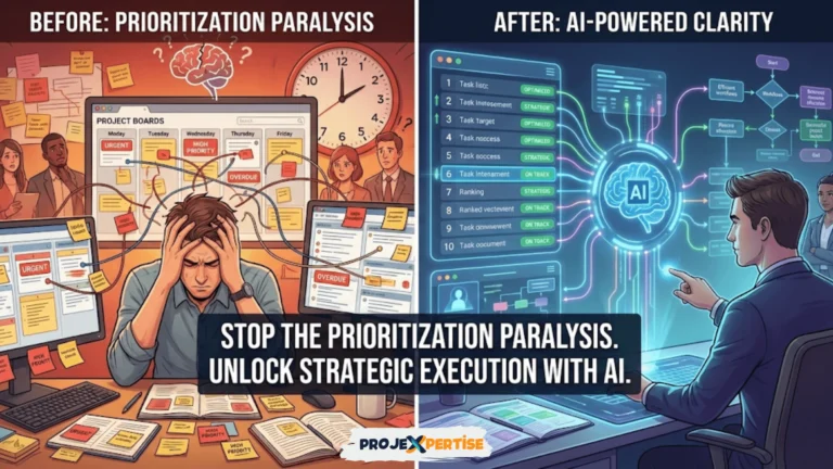
In project management, visibility is critical. Without clear and consistent insight into task progress, resource usage, and delivery timelines, even the most organized teams can veer off course. The difference between successful and struggling projects often comes down to information accessibility—knowing what’s happening, where problems are emerging, and when intervention is needed.
Dashboards in project management software provide a centralized, visual hub that helps keep teams aligned, stakeholders informed, and risks under control. They transform raw data scattered across tasks, timesheets, and status updates into coherent narratives that drive action. Rather than hunting through multiple screens or requesting reports, stakeholders see current reality at a glance.
From simple status overviews to complex KPI tracking, dashboards give you real-time insight that turns data into action. They serve as operational control centers reflecting your project’s heartbeat. In this comprehensive guide, you’ll learn how to set up effective dashboards, choose the right tools, optimize them for ongoing performance, and avoid common pitfalls that undermine their value.
Why Dashboards Are Essential for Modern Project Management
Modern dashboards serve as more than just status reports. They act as operational control centers that reflect the heartbeat of your project, enabling proactive management rather than reactive firefighting. The shift from periodic reporting to continuous visibility fundamentally changes how teams work.
Real-Time Visibility Transforms Management
Dashboards compile project data into at-a-glance views, helping project managers track performance indicators like progress, task status, and upcoming deadlines instantly. This saves hours of manual reporting that traditionally consumed manager time. Instead of compiling status reports, managers analyze patterns and make decisions.
The real-time nature eliminates the information lag that plagues traditional reporting. When status updates happen weekly, problems discovered on Tuesday aren’t addressed until the following Monday’s meeting. Real-time dashboards surface issues immediately, enabling intervention while options still exist. This agility prevents small problems from becoming crises.
Visual presentation makes patterns obvious that tables of numbers obscure. Trends in velocity, emerging bottlenecks, or resource constraints reveal themselves through charts and graphs. The human brain processes visual information far faster than text or numbers. Well-designed dashboards leverage this to accelerate comprehension. Understanding project management basics helps contextualize dashboard design.
Centralized information reduces the tool-switching and context-switching that fragments attention. Rather than checking timesheets, then budget systems, then task trackers, managers see integrated views. This consolidation doesn’t just save time—it enables holistic thinking that isolated data prevents. Connections between schedule delays and budget overruns become obvious when both metrics appear together.
Building Stakeholder Confidence Through Transparency
Sharing dashboards with internal teams and external clients improves transparency dramatically. Everyone stays on the same page with live metrics, rather than waiting for status update meetings or manual summaries. This transparency builds trust that vague assurances never achieve. Stakeholders see reality rather than filtered interpretations.
Client-facing dashboards particularly transform customer relationships. When clients can check project status themselves rather than requesting updates, anxiety decreases and satisfaction improves. Self-service visibility respects customer time while demonstrating confidence in your processes. This transparency differentiates professional organizations from those hiding behind opacity.
Internal transparency aligns teams by eliminating information asymmetry. When everyone sees the same data, political arguments about priorities or resource allocation diminish. Decisions become data-driven rather than opinion-based. This shift from politics to evidence improves both decisions and organizational culture. Effective stakeholder communication builds on dashboard visibility.
Executive confidence grows when leaders can verify project health independently. Rather than depending on manager assertions that everything is fine, executives check dashboards and form their own conclusions. This verification capability doesn’t indicate distrust—it enables appropriate oversight without micromanagement. Leaders who can see for themselves ask better questions and provide better support.
Enabling Data-Driven Decision Making
Whether you’re identifying resource bottlenecks or flagging cost overruns, dashboards highlight trends quickly, enabling teams to make informed adjustments in real time. The speed of insight directly correlates with response effectiveness. Fast feedback loops enable continuous course correction rather than major pivots after problems compound.
Pattern recognition improves with visual display. Seasonality in productivity, correlation between certain task types and delays, or resource conflicts that repeat predictably—all become obvious through dashboard analysis over time. These insights inform better planning for future projects. Learning compounds when data is accessible and comprehensible.
Scenario analysis becomes possible when current state is clear. Dashboards showing actual performance enable projections. If velocity continues at the current rate, when will the project complete? If the budget burns at the current pace, will funding last through delivery? These forecasts support proactive rather than reactive management. Teams addressing project management challenges benefit from dashboard-enabled foresight.
Objective evaluation replaces subjective assessment. Rather than managers asserting that teams are working hard or progress is good, metrics quantify reality. This objectivity improves accountability and enables fair evaluation. Team members know exactly what’s expected and how they’re performing against standards.
Core Metrics Every Dashboard Should Include
While each dashboard can and should be customized for specific contexts, certain metric categories consistently add value across project types. These foundational metrics provide comprehensive project visibility when displayed together.
Progress Metrics: Understanding Completion
Task completion percentage shows finished tasks versus total planned work. This simple metric provides immediate orientation—are we ahead, behind, or on track? However, raw task counts can mislead when tasks vary greatly in size or complexity. Weight tasks appropriately or supplement with effort-based completion metrics.
Milestone tracking monitors delivery of key project checkpoints that represent major achievements or decision points. Milestones provide higher-level visibility than individual tasks. They mark the forest rather than individual trees. Stakeholders caring more about outcomes than activities appreciate milestone-focused dashboards. Color-coded milestone status enables instant assessment of project health.
Sprint or phase completion for Agile or staged projects shows progress within iterations. This granular view matters for teams working in sprints who need to know whether the current iteration will achieve its goals. Burndown charts visualizing remaining work over sprint duration provide predictive insight into sprint success. Understanding Agile vs Waterfall methodologies informs appropriate progress metrics.
Earned value analysis integrates schedule and cost performance into single metrics. Earned value shows the budgeted cost of work actually completed. This sophisticated metric reveals whether you’re getting good value for money spent. Projects can be under budget but behind schedule, or vice versa. Earned value exposes these nuances that simpler metrics miss.
Resource Metrics: Optimizing Capacity
Team workload visualizations show the distribution of tasks per team member, revealing overallocation and available capacity. Heatmaps using color to indicate utilization levels enable instant pattern recognition. Managers spot overloaded individuals or underutilized capacity at a glance. Balancing workload prevents burnout while maximizing productivity.
Skill availability tracking shows whether specialized expertise is available when needed. Not all team members are interchangeable—designers, developers, and data scientists bring different capabilities. Dashboards showing skill availability alongside project needs enable intelligent assignment. Resource constraints often revolve around specific skills rather than total headcount.
Time tracking integration displays actual hours worked versus estimated effort. This comparison reveals estimation accuracy and identifies tasks consuming disproportionate effort. Over time, estimation improves as patterns become visible. Chronic underestimation of certain task types becomes obvious, informing better future planning. Comprehensive time tracking tools feed dashboard metrics.
Utilization rates show productive work as a percentage of total available time. While 100% utilization sounds ideal, sustainable productivity requires buffer for learning, improvement, and handling surprises. Target 75-85% billable utilization for knowledge workers. Dashboards showing utilization trends reveal whether teams are overworked or underutilized. Both extremes create problems requiring management attention.
Financial Metrics: Controlling Costs
Budget consumption tracks expenses against approved budget in real-time, preventing overruns through early warning. Simple gauges showing percentage of budget consumed versus percentage of timeline elapsed provide instant financial health assessment. If 80% of budget is consumed when only 50% complete, intervention is clearly needed.
Burn rate displays spending velocity, enabling projection of when funding will exhaust. This forward-looking metric particularly matters for fixed-budget projects or startups managing runway. Dashboards projecting funding exhaustion date based on current burn rate enable proactive fundraising or cost reduction. Understanding how to measure ROI complements budget tracking.
Cost variance analyzes actual costs versus planned spending at granular levels. Variances indicate where estimates were inaccurate or where unexpected expenses arose. This analysis informs both corrective action on current projects and improved estimation for future work. Variance trends reveal systematic estimation bias requiring process changes.
Profitability tracking for client work shows whether projects generate expected margins. Not all revenue is equally profitable. Some clients or project types consistently deliver better returns. Data-driven insights inform strategic decisions about which work to pursue. Profitability dashboards transform project management from purely operational to strategic.
Risk and Issue Metrics: Managing Threats
Open issues flag unresolved blockers requiring attention before they impact delivery. Issue age—how long problems remain unresolved—indicates whether escalation is needed. Aging issues often indicate resource constraints, technical complexity, or stakeholder unavailability. Dashboard visibility ensures problems don’t languish forgotten.
Risk scores quantify potential threats based on likelihood and impact, enabling prioritized mitigation. Qualitative risk registers listing potential problems help, but quantified scoring enables comparison. High-likelihood, high-impact risks deserve immediate attention while low-probability, low-impact risks may be accepted. Visual risk matrices plotting these dimensions make priorities obvious.
Trend analysis shows whether risk exposure is increasing or decreasing over time. Early project stages typically show high risk that decreases as unknowns resolve. If risk exposure increases later in projects, something is wrong. This trending provides early warning of systemic problems requiring investigation.
Mitigation effectiveness tracks whether risk responses actually reduce exposure. Planned risk responses should decrease probability or impact measurably. Dashboards showing before-and-after risk scores for mitigation actions reveal whether responses work. This learning improves risk management capability over time.
Comprehensive Dashboard Setup Process
Creating effective dashboards requires methodical approach balancing comprehensiveness with usability. Rushing through setup produces cluttered, confusing displays that nobody uses. Following structured process ensures your dashboard actually delivers value.
Step 1: Define Clear Purpose and Audience
Start by determining what your dashboard needs to achieve specifically. Is it for internal team coordination? Client updates? Executive oversight? Risk monitoring? Financial control? Purpose determines appropriate metrics, refresh frequency, and access permissions. Multi-purpose dashboards often fail by trying to serve everyone and satisfying no one.
Identify primary and secondary audiences explicitly. Primary users interact with dashboards daily, requiring operational detail and frequent updates. Secondary audiences check dashboards periodically, needing high-level summaries without overwhelming detail. Different audiences often need different dashboard views from the same underlying data.
Define success criteria for your dashboard before building it. How will you know if it works? Successful dashboards change behavior—they inform decisions, trigger interventions, or enable self-service reporting. If your dashboard exists but nobody’s actions change, it’s decorative rather than functional. Clear success criteria guide design choices.
Align widget choices with audience needs and technical literacy. Executives comfortable with financial analysis appreciate sophisticated charts while operational team members might need simpler visualizations. Match complexity to capability. The best dashboard is the one people actually understand and use regularly.
Step 2: Select Appropriate Software Platform
Popular tools like ClickUp, Smartsheet, Asana, and Jira offer different levels of dashboard customization. Your choice should be based on feature needs, integration flexibility, ease of use, and existing technology stack. Replacing working tools to get better dashboards rarely makes sense—start with dashboards your current tools support.
ClickUp works best for teams needing diverse dashboard types including time tracking, goal setting, workload views, and custom widgets. The platform’s flexibility supports complex scenarios without requiring coding. Multiple dashboard types serve different purposes within single projects. Pricing starts at $5 per user monthly for basic features, with advanced capabilities in higher tiers.
Smartsheet excels for financial tracking and resource-heavy projects needing spreadsheet-like flexibility. Organizations transitioning from Excel appreciate familiar interfaces combined with collaboration features. The platform handles large datasets and complex formulas better than purely visual tools. Pricing starts at $7 per user monthly.
Jira is tailored to Agile workflows and sprint reporting, particularly for software development teams. Native support for burndown charts, velocity tracking, and sprint metrics makes Jira ideal for development contexts. However, non-technical teams often find Jira overwhelming. Pricing starts at $7.75 per user monthly. Teams comparing Jira vs Trello should consider dashboard sophistication.
Asana provides user-friendly timeline views and visual status boards accessible to non-technical users. The clean interface and intuitive navigation accelerate adoption. However, Asana’s dashboard capabilities are less sophisticated than ClickUp or Smartsheet. Pricing starts at $10.99 per user monthly. Organizations evaluating ClickUp vs Asana should weigh dashboard depth against usability.
Microsoft Project offers enterprise-grade tracking and resource management with dashboards focused on Gantt timelines, critical paths, and resource costs. Large organizations with complex projects appreciate Project’s sophistication despite steep learning curve. Pricing starts at $10 per user monthly for cloud versions.
Step 3: Identify Key Metrics and Widgets
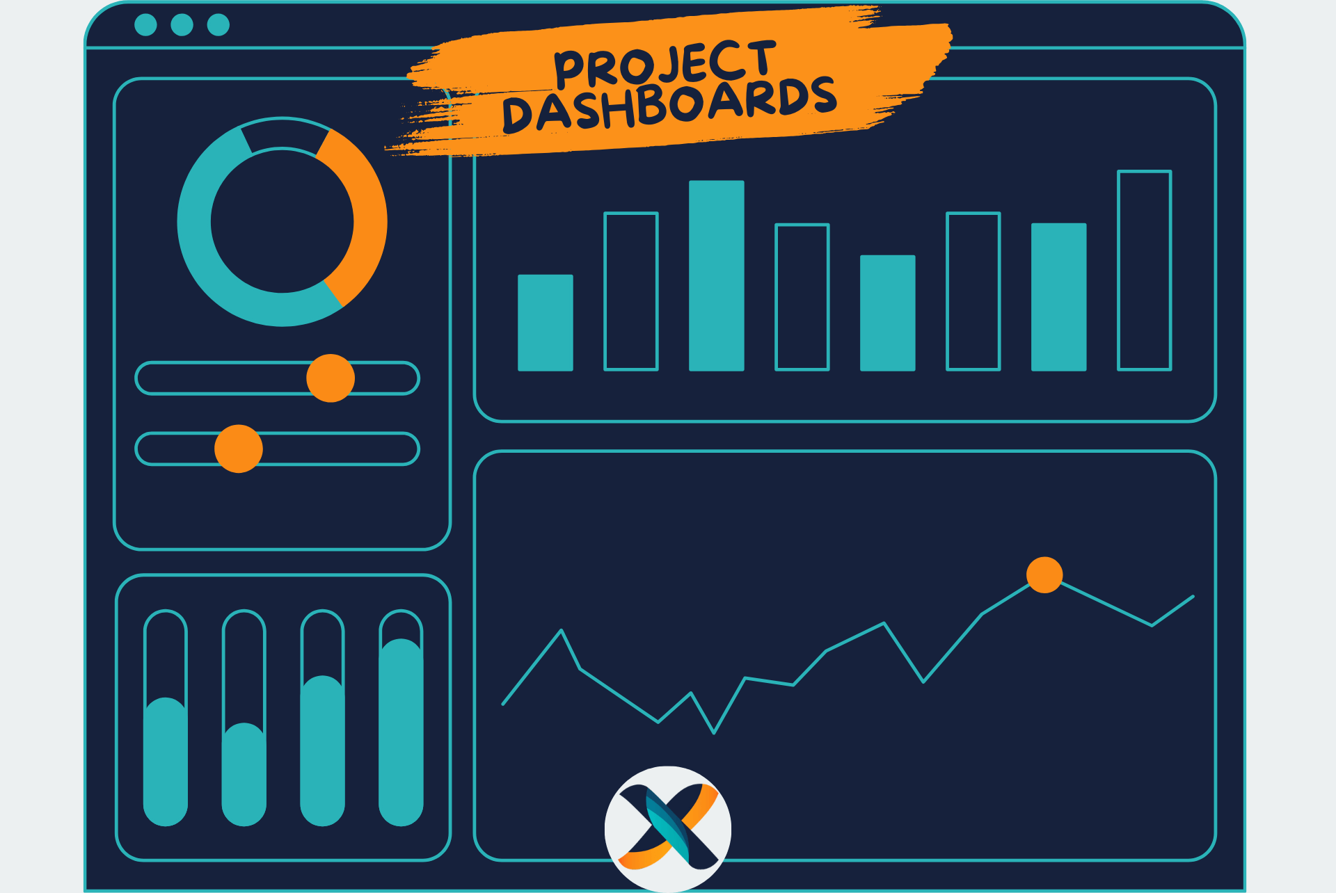
Avoid overloading your dashboard with unnecessary visuals that create noise rather than signal. Start with a handful of high-priority widgets such as task status bars, budget dials, risk lists, and milestone timelines. Five to eight widgets typically suffice for focused dashboards. Cramming more creates cognitive overload.
Group widgets logically for easy scanning based on relationship or frequency of reference. Financial metrics cluster together, progress metrics form another group, and risk information constitutes a third section. This organization enables users to find information quickly without scanning randomly placed widgets.
Use widget types appropriate for data being displayed. Gauges work well for single values like budget consumption or completion percentage. Line charts show trends over time like velocity or burn rate. Bar charts compare values across categories like effort by team or task status distribution. Tables list detailed items like open risks or upcoming milestones. Choosing appropriate visualization improves comprehension.
Establish clear definitions for metrics and calculations to prevent confusion. What exactly constitutes “completion”—started tasks, finished tasks, or accepted deliverables? Definitions matter and should be documented visibly. Misaligned understanding of metrics leads to misguided decisions. Understanding essential software features helps identify dashboard capabilities.
Step 4: Enable Automation and Real-Time Syncing
Real-time updates are essential for dashboard value. Ensure your dashboards automatically sync to task boards, timesheets, and resource trackers without manual intervention. Stale data undermines trust and leads to decisions based on outdated information. Automation eliminates the manual refresh that people inevitably forget.
Configure notifications for important events like budget overruns, missed deadlines, or high-priority issues. Push notifications draw attention to situations requiring immediate response. However, excessive alerts create fatigue where people ignore notifications entirely. Carefully calibrate thresholds to alert on significant events while filtering noise.
Integrate with existing tools in your technology stack rather than requiring duplicate data entry. If time tracking happens in one system, automatically pull that data into dashboards. If budgets live in financial software, integrate rather than manually transcribing. Integration maintains accuracy while reducing administrative burden. Comprehensive workflow automation extends beyond dashboards.
Establish data quality standards and validation rules that prevent garbage-in-garbage-out problems. Automated validation catches common errors like negative time entries, completion percentages exceeding 100%, or costs assigned to wrong budget categories. Quality checks maintain dashboard credibility. Bad data displayed prominently is worse than no data.
Step 5: Test, Gather Feedback, and Iterate
Pilot your dashboard with internal teams first before sharing with stakeholders. Use it operationally for several weeks, identifying what works and what creates confusion. Early adoption reveals usability issues and missing metrics that theoretical design overlooks. Real usage is the ultimate test.
Gather feedback on clarity, relevance, and layout systematically through surveys, interviews, and observation. Different people notice different issues. Comprehensive feedback collection reveals patterns that individual comments miss. Ask both what users like and what frustrates them. Positive feedback indicates what to preserve while criticism reveals improvement opportunities.
Share read-only versions with external stakeholders like clients or executives after internal refinement. External audiences often need simplified views without internal operational detail. Create stakeholder-specific dashboards rather than exposing everything to everyone. Appropriate information-sharing builds confidence without overwhelming or boring audiences.
Evolve dashboard design based on actual usage patterns rather than theoretical preferences. Analytics showing which widgets are viewed frequently versus ignored inform optimization. Unused widgets clutter interfaces without adding value. Remove or redesign elements that people don’t reference. Continuous improvement keeps dashboards relevant as projects and needs evolve.
Best Practices for Sustained Dashboard Excellence
Initial setup creates foundation, but sustained value requires ongoing attention and optimization. Dashboards degrade over time as projects evolve and initial designs become outdated. Treating dashboards as living tools rather than static artifacts maintains their utility.
Maintaining Sharp Focus
Avoid dashboard bloat where too many metrics distract from what matters most. Focus on the top five to eight indicators tied directly to success criteria. Each widget should support specific decisions or actions. If a metric is interesting but doesn’t inform behavior, it’s decorative noise reducing overall effectiveness.
Regularly audit metrics to ensure continued relevance as project phases change. Early-stage metrics about requirements gathering matter less during delivery. Risk profiles evolve as unknowns resolve. Dashboard content should reflect current project needs rather than comprehensive historical coverage. Remove or archive widgets that no longer serve active purposes.
Resist pressure to add “just one more” widget without removing something else. Bounded dashboards force prioritization of what truly matters. Unlimited expansion creates cluttered displays that nobody uses effectively. Saying no to additions preserves focus. If something new is critical, identify what it replaces rather than just adding.
Periodically simplify dashboards by removing marginal metrics that seemed important initially but rarely influence decisions. After several months of usage, patterns emerge showing what’s actually referenced versus what’s ignored. Act on this learning by pruning. Simplification often improves utility more than addition. Teams managing resource essentials appreciate focused dashboards.
Leveraging Visual Design Principles
Color coding using conventions like red for risk, green for on-track, and yellow for caution helps the eye navigate quickly. Consistent color meaning across widgets enables instant comprehension without reading labels. However, consider color blindness—red/green combinations create problems for significant populations. Use patterns or icons in addition to color.
Place urgent or time-sensitive widgets at the top of dashboards where they receive immediate attention. Visual hierarchy guides attention to priorities. Less critical information can appear lower. Left-to-right, top-to-bottom reading patterns matter. Position critical metrics where users naturally look first.
Use whitespace strategically to group related widgets and separate distinct sections. Cramming widgets tightly together creates visual chaos. Space provides breathing room that improves comprehension. Don’t feel obligated to fill every pixel—emptiness serves valuable organizational purposes.
Maintain consistency in design across multiple dashboards. If your organization uses several dashboards for different purposes, consistent style guides navigation. Users shouldn’t need to relearn interpretation methods. Standardization accelerates comprehension and reduces cognitive load across dashboard portfolio.
Ensuring Accessible Everywhere
Make dashboards accessible via mobile devices, browsers, and embedded links to accommodate different work contexts. Project managers in the field need mobile access. Remote workers access through browsers. Meeting rooms display embedded versions. Multi-platform availability ensures visibility regardless of location or device.
Use permission settings to control who can view, edit, or share dashboards appropriately. Not all information suits all audiences. Financial details might be restricted to managers. Client-facing dashboards exclude internal operational metrics. Granular permissions balance transparency with appropriate confidentiality.
Enable easy sharing through URLs, exports, or scheduled distribution. Stakeholders shouldn’t need special software or training to view dashboards. Simple URL sharing opens access broadly. PDF exports work for offline review. Scheduled email distribution pushes updates to stakeholders proactively. Accessibility drives usage.
Optimize load times and performance, particularly for complex dashboards with many widgets or large datasets. Slow dashboards frustrate users who abandon them in favor of faster alternatives. Performance optimization might require data aggregation, caching strategies, or limiting historical range displayed. Speed matters for adoption.
Establishing Update Cadence
Either automate updates via your project management software or set explicit weekly review cadence. Automated real-time updates are ideal when technically feasible. For dashboards requiring manual data entry or calculation, establish clear schedules. Monday morning updates or Friday close-of-week refreshes create predictable rhythms.
Document update processes and responsibilities clearly when automation isn’t possible. Who ensures data currency? What happens if they’re unavailable? Clear ownership prevents dashboards from quietly becoming stale without anyone noticing until they’re seriously outdated.
Review dashboard content during regular team ceremonies like sprint retrospectives or weekly status meetings. Collective review creates shared understanding while catching interpretation errors. Discussing dashboards embeds them into team culture rather than leaving them as manager-only tools.
Archive or sunset dashboards that are no longer actively used rather than allowing zombie dashboards to persist. Unused dashboards create confusion about what’s current. Periodically audit dashboard usage and decommission those that have outlived utility. This hygiene maintains focus on truly valuable dashboards.
Integrating with Broader Ecosystems
Dashboards work even better when paired with portfolio-level reports or executive summaries providing context. Single-project dashboards show local optimization but miss portfolio interactions. Program-level dashboards aggregate across projects, revealing resource conflicts or strategic misalignment invisible in individual dashboards.
Tools that integrate with Power BI, Tableau, or Google Data Studio extend analytical capabilities beyond native dashboard features. While project management tools provide operational dashboards, business intelligence platforms enable sophisticated analysis. The combination serves both tactical execution and strategic insight. Comprehensive reporting tools complement dashboard systems.
Connect dashboards to your organization’s data warehouse or business intelligence infrastructure for historical analysis and cross-functional visibility. Today’s project metrics combined with financial data, customer satisfaction, or market trends reveal connections that isolated systems miss. This integration supports truly data-driven decision-making rather than siloed analysis.
Create dashboard libraries or galleries where teams can discover and learn from each other’s approaches. Organizations develop valuable expertise in dashboard design. Sharing examples accelerates learning while promoting consistency. Gallery browsing often sparks ideas that improve your own dashboards through inspiration and adaptation.
Advanced Dashboard Techniques
Beyond basic setup, sophisticated approaches unlock greater value for mature teams ready to level up their dashboard game. These advanced techniques require more effort but deliver commensurately greater benefits.
Building Role-Specific Dashboard Views
Create customized dashboard variants for different roles like project managers, team members, executives, and clients. Each audience cares about different metrics at different detail levels. Rather than generic dashboards that partially serve everyone, role-specific views perfectly match each stakeholder’s needs.
Project manager dashboards emphasize operational detail supporting daily decisions about task assignments, risk mitigation, and resource balancing. They need granular data and frequent updates. Drill-down capabilities enabling deep investigation of anomalies or issues support their tactical responsibilities.
Executive dashboards provide high-level summaries focused on strategic questions about overall health, major risks, and budget status. Executives don’t need task-level detail but require clear indicators of whether intervention is needed. Exception-based displays highlighting only items requiring attention respect executive time.
Team member dashboards focus on individual responsibilities showing personal tasks, upcoming deadlines, and how individual work contributes to broader project goals. Context about why work matters and how it fits into the bigger picture improves motivation and alignment. Team dashboards democratize visibility beyond managers.
Client dashboards emphasize outcomes over process, showing progress toward deliverables and milestones rather than internal operational details. Clients care about value received, not about your team’s internal resource allocation. Professional, polished presentations appropriate for external audiences differ from internal working dashboards.
Implementing Predictive Analytics
Leverage historical data to forecast completion dates, final costs, or quality outcomes based on current trends. Simple trend-line extensions provide rough predictions. More sophisticated approaches use statistical modeling or machine learning. Even basic forecasting supports proactive planning rather than reactive scrambling.
Earned value projections estimate final cost and schedule variance based on current performance. If you’re 40% complete but have consumed 60% of budget, projections warn of overruns. Schedule performance index below 1.0 indicates delays. These predictive metrics enable intervention while correction is still possible.
Monte Carlo simulations model probability distributions for project outcomes considering multiple variables and their interdependencies. Rather than single-point forecasts claiming certainty, simulations show ranges of possible outcomes with associated probabilities. This realistic uncertainty quantification supports better risk management.
Anomaly detection using statistical thresholds or machine learning flags unusual patterns requiring investigation. Velocity suddenly dropping, unplanned budget spikes, or quality metrics degrading all deserve attention. Automated detection catches problems humans might miss while drowning in data. Understanding budgeting and resource tools supports advanced analytics.
Creating Dynamic Filtering and Drill-Down
Enable users to filter dashboards by project phase, team, priority, or other relevant dimensions. Interactive filtering allows single dashboards to serve multiple purposes rather than requiring dozens of static variants. Users customize views on-demand rather than requesting new dashboard versions.
Implement drill-down capabilities where clicking high-level metrics reveals supporting detail. Executives viewing project health summaries can click concerning items to investigate root causes. This layered information architecture serves both strategic overview and tactical investigation from single starting points.
Configure linked dashboards where selection in one dashboard filters related dashboards automatically. Clicking a specific project in a portfolio view navigates to that project’s detailed dashboard. Clicking a team member in a workload view shows their task list. These connections create fluid navigation through information layers.
Support cross-filtering where selection in one widget filters all other widgets on the dashboard. Selecting a specific sprint in a timeline filters tasks, team workload, and burndown charts to that sprint. This interactivity enables exploratory analysis without requiring numerous pre-configured dashboard variants. Teams using collaboration tools appreciate interactive dashboards.
Embedding External Data Sources
Integrate customer data from CRM systems showing client history, contract value, or satisfaction scores alongside project metrics. Understanding customer strategic importance informs priority decisions. High-value clients receive appropriate attention while routine projects proceed efficiently. This context improves decision quality.
Connect financial systems providing actual cost data, invoice status, or profitability calculations. Project management tools track estimated costs and effort but often lack actual financial information. Integration creates comprehensive views showing both operational and financial performance. This completeness supports truly informed management.
Link support or ticketing systems showing customer issues, bug reports, or enhancement requests related to projects. Customer feedback directly visible on project dashboards closes the loop between delivery and satisfaction. Teams see impact of their work rather than operating blindly.
Include market data or competitive intelligence informing strategic context around projects. External factors like competitor moves, market trends, or regulatory changes influence project priorities and approaches. Displaying this context alongside project metrics enables strategy-aware execution.
Transforming Dashboards from Reports to Strategic Assets
The real power of dashboards emerges when they begin influencing decisions, resource plans, and even strategy fundamentally. If you consistently review dashboard data in retrospectives or leadership meetings, patterns emerge that guide better planning and execution. This transformation from passive reporting to active management represents dashboard maturity.
Building Data-Driven Culture
Encourage regular dashboard review rituals where teams collectively analyze patterns and draw conclusions. Monday morning dashboard reviews or Friday retrospectives examining weekly trends embed data into team rhythm. Collective interpretation builds shared understanding while catching misinterpretations that individuals make privately.
Train team members to ask “what does the data show?” rather than relying on intuition or loudest voices. Data-driven cultures prize evidence over opinion. This doesn’t eliminate judgment—it grounds judgment in reality. Team members seeing metrics relevant to their work become more engaged and accountable.
Celebrate insights derived from dashboard analysis publicly to reinforce data-driven behavior. When someone spots a pattern leading to improvement, recognize that contribution visibly. Recognition creates positive reinforcement driving desired culture. Success stories demonstrate dashboard value to skeptics.
Address resistance to transparency honestly by explaining how visibility benefits individuals rather than threatening them. Some team members fear dashboards enable micromanagement or blame. Reassure that dashboards support and empower rather than surveil. Use dashboards for learning and improvement, not punishment, and demonstrate this consistently through actions.
Enabling Continuous Improvement
You may discover through sustained dashboard analysis that certain teams overestimate their delivery capacity consistently. This pattern invisible in individual project post-mortems becomes obvious when dashboard data spans multiple projects. Recognition enables correction through better estimation, adjusted capacity planning, or process changes addressing root causes.
Identify that certain clients regularly introduce last-minute scope changes disrupting carefully made plans. Dashboard visibility of this pattern enables strategic decisions about contract terms, engagement models, or pricing approaches accounting for volatility. Learning from patterns prevents repeated mistakes.
Reveal systematic resource bottlenecks where specific skills or individuals consistently become critical path constraints. This insight informs hiring priorities, training investments, or process changes reducing dependency. Strategic workforce planning replaces reactive scrambling when data exposes persistent constraints.
Discover that certain project types consistently exceed estimates in predictable ways. Maybe user interface work always takes 50% longer than estimated. Recognizing patterns enables calibrated estimation accounting for reality rather than continuing to underestimate systematically. Learning compounds improvement over time.
Measuring Dashboard ROI
Calculate time savings from automated dashboards replacing manual reporting. Managers spending five hours weekly compiling status reports now spend that time on value-added activities. Multiply these hours across teams and projects to quantify significant returns. Even expensive dashboard platforms prove economical relative to labor costs.
Track improved decision quality through faster problem detection or better resource allocation. While harder to quantify precisely, improved outcomes from data-driven decisions justify dashboard investments. Post-project reviews comparing dashboard-equipped to non-dashboard projects reveal measurable differences in success rates.
Monitor stakeholder satisfaction improvements from enhanced visibility and transparency. Client retention, executive confidence, and team morale all improve with better information flow. While indirect, these benefits often exceed direct efficiency gains. Happy stakeholders and engaged teams deliver better outcomes.
Document specific decisions or interventions enabled by dashboard insights. Compiled over time, these stories demonstrate concrete value that skeptics find compelling. Each example where dashboards prevented problems or optimized performance builds the business case for continued investment.
Your Dashboard Excellence Journey
Getting to dashboard-driven management doesn’t require complex software or data science skills. It simply requires intentional setup, discipline in usage, and willingness to iterate based on learning. Start small, prove value, then expand gradually. This measured approach builds capability that ultimately transforms organizational effectiveness.
Starting Your Implementation
Identify one high-value use case where dashboard visibility would clearly improve outcomes. Perhaps tracking budget consumption preventing overruns, or monitoring workload preventing burnout. Focused initial implementation proves value quickly. Success builds momentum and credibility for expansion.
Choose tools you already have before purchasing new platforms specifically for dashboards. Most modern project management software includes dashboard capabilities. Leverage existing investments rather than adding complexity. Later, after proving value and identifying limitations, consider purpose-built solutions if needed. Understanding your Airtable options helps evaluate platforms.
Create simple dashboards initially with few widgets rather than trying to display everything. Five carefully chosen metrics displayed clearly beat twenty metrics creating confusion. Simplicity accelerates adoption while complexity overwhelms. Add sophistication gradually as users become comfortable with basics.
Gather feedback continuously and iterate based on actual usage. Don’t assume your initial design is perfect. Users will reveal improvements you never considered. Responsive evolution based on input builds trust while improving utility. This learning mindset separates successful implementations from failures.
Building Long-Term Excellence
Document best practices and standards emerging from experience to guide future dashboard development. As organizational dashboard expertise grows, capture learning. Written guidelines help new teams avoid mistakes while promoting consistency. Knowledge management multiplies individual learning across organizations.
Develop internal champions who evangelize dashboard benefits and support colleagues. These advocates accelerate adoption more effectively than top-down mandates. Champions created through genuine involvement become authentic promoters. Their passion and expertise serve peer learning better than formal training.
Integrate dashboard review into regular project rituals until it becomes habitual. Weekly reviews, sprint retrospectives, or monthly governance meetings should include dashboard analysis. Ritual embeds practice into culture. Eventually, checking dashboards before meetings or decisions becomes automatic.
Continuously challenge whether dashboards still serve their intended purposes or have become stale. Periodic audits ensure alignment with current needs rather than historical purposes. Sunset outdated dashboards, refresh others, and create new ones as requirements evolve. Active curation maintains portfolio relevance.
The journey from basic status tracking to dashboard-driven strategic management represents significant organizational maturity. Visibility transforms management from reactive to proactive. Data grounds decisions in reality rather than opinion. Transparency builds trust across organizational boundaries. These benefits compound over time as dashboards become integral to how teams work rather than supplementary tools occasionally referenced.
Your path to dashboard excellence begins with commitment to start and discipline to sustain. Perfect dashboards don’t exist, but useful dashboards continually improve through thoughtful iteration. Begin today with one focused dashboard solving one clear problem. Learn from that experience. Expand gradually. Let results build momentum. Over time, dashboard-enabled visibility transforms project management from art to science, from intuition to evidence, from reactive to strategic.